
Note
Go to the end to download the full example code.
Model Interpretation: PDP vs ALE#
In this notebook, we compare Partial Dependence Plots (PDP) and Accumulated Local Effects (ALE).
The Problem with PDP#
PDPs work by marginalizing over the distribution of the features. If features \(X_1\) and \(X_2\) are highly correlated, the PDP will calculate predictions for points that are impossible (e.g. a 100 \(\mathrm{m}^2\) apartment with 10 bedrooms). This leads to extrapolation bias.
The ALE Solution#
ALE plots, proposed by Apley and Zhu[1], calculate the model’s behavior based on conditional distributions. They only look at how the prediction changes when a feature varies locally, given the values of other features.
Creating a Synthetic Correlated Dataset#
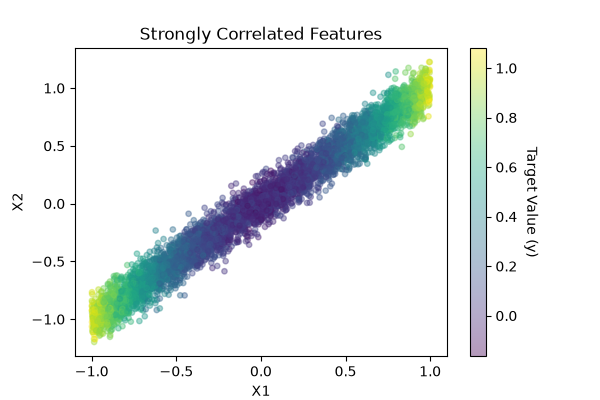
To easily witness this phenomenon, we will generate a synthetic dataset containing a deliberate statistical trap:
We generate two features, \(X_1\) and \(X_2\), which are strongly correlated.
We define the target variable \(y\) to depend only on \(X_1\) via a quadratic function:
The Goal: Because \(y\) has no direct connection to \(X_2\), an ideal interpretation method must return a completely flat line at zero for \(X_2\).
import matplotlib.pyplot as plt
import numpy as np
import pandas as pd

n_samples = 5000
generator = np.random.default_rng(92)

X1 = generator.uniform(-1, 1, n_samples)
X2 = X1 + generator.normal(0, 0.1, n_samples)  # Strong correlation with X1

y = X1**2 + generator.normal(0, 0.05, n_samples)

X = pd.DataFrame({"X1": X1, "X2": X2})

plt.figure(figsize=(6, 4))
plt.scatter(X["X1"], X["X2"], c=y, cmap="viridis", alpha=0.4, s=15)
cbar = plt.colorbar()
cbar.set_label("Target Value (y)", rotation=270, labelpad=15)
plt.title("Strongly Correlated Features")
plt.xlabel("X1")
plt.ylabel("X2")
plt.show()
Training the model#
We train a RandomForestRegressor from scikit-learn. Because \(X_1\) and \(X_2\) are similar, the model might use both to predict \(y\), especially when we set max_features=’sqrt’.
from sklearn.ensemble import RandomForestRegressor
from sklearn.model_selection import train_test_split

X_train, X_test, y_train, y_test = train_test_split(
    X, y, test_size=0.3, random_state=92
)

model = RandomForestRegressor(max_features="sqrt", random_state=92)
model.fit(X_train, y_train)

r2_test_score = model.score(X_test, y_test)
print(f"R² score on the test set: {r2_test_score:.2f}")
R² score on the test set: 0.97
Comparison: PDP vs ALE for Feature \(X_2\)#
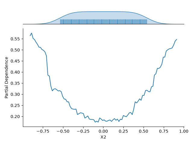
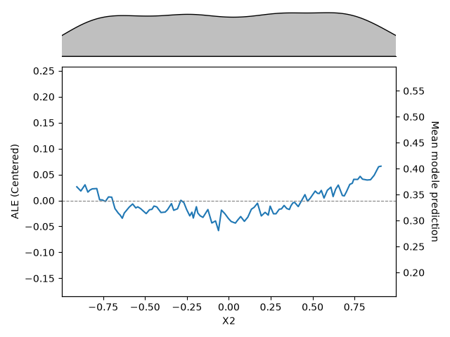
Now, we plot the interpretation curves for \(X_2\) using both methods to observe how they process the correlation.
from hidimstat.visualization import ALE, PDP

# 1. Partial Dependence Plot (PDP)
pdp = PDP(model, feature_names=X.columns)
pdp_axes = pdp.plot(X_test, features=1)

# 2. ALE Plot
ale = ALE(model, feature_names=X.columns)
ale_axes = ale.plot(
    X_test, features=1, grid_resolution=100, confidence_level=0
)

mean_pred = model.predict(X_test).mean()
pdp_ymin, pdp_ymax = pdp_axes[1].get_ylim()
ale_axes[1].set_ylim(pdp_ymin - mean_pred, pdp_ymax - mean_pred)
ale_axes[1].figure.axes[2].set_ylim(pdp_ymin, pdp_ymax)

plt.show()
Conclusion#
The PDP shows a prominent U-shaped parabola for \(X_2\) because of extrapolation. An analyst looking at this plot could falsely conclude that increasing or decreasing \(X_2\) directly increases the target variable. This is an error since it is actually the result of out-of-distribution artifacts.
ALE shows a mostly flat line (near zero), isolating the unique contribution of \(X_2\) by blocking the shadow effect of \(X_1\). This isolates the direct non-impact, which is ideal for understanding pure mechanisms, though it leaves out indirect operational levers.
References#
Total running time of the script: (0 minutes 1.873 seconds)
Estimated memory usage: 250 MB